 24 June 2021
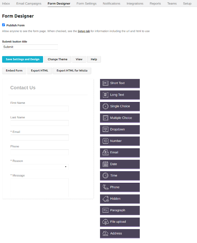
The form designer tab allows you to configure the fields of your form.
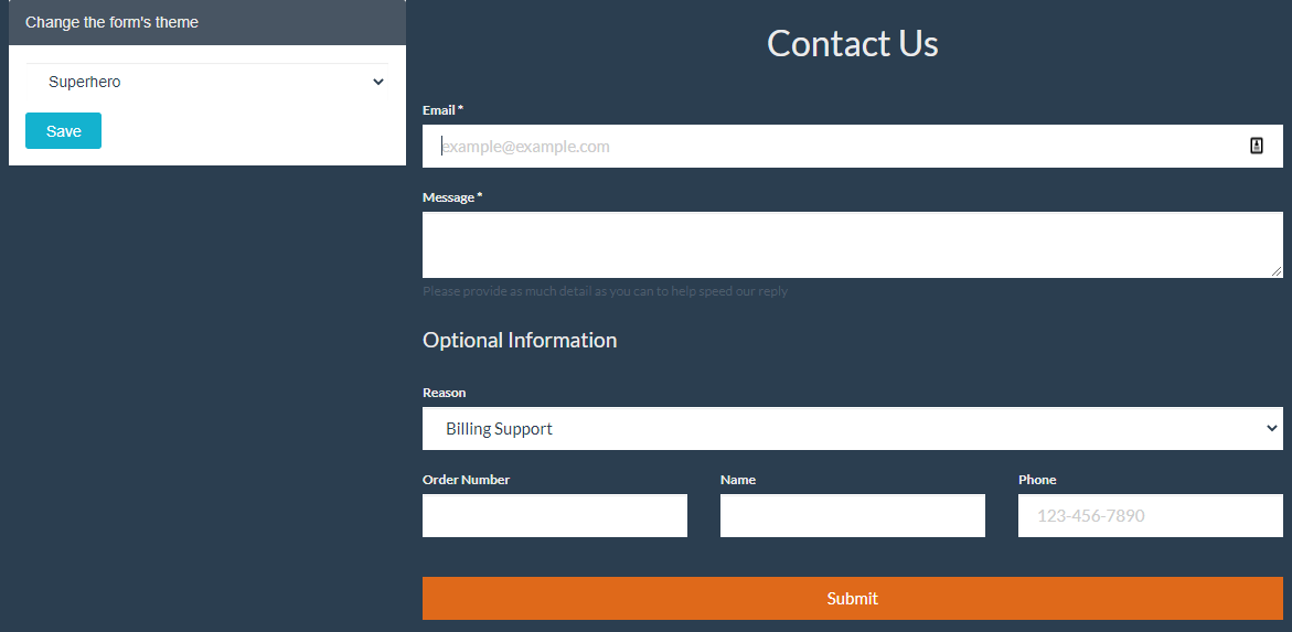
We now have a dropdown menu to change the UI theme of your form (our current default theme is Superhero) and quick buttons for you to view forms using that template.
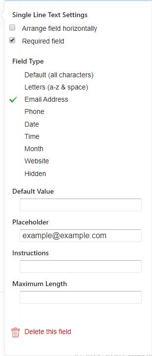
If you hover your mouse over certain fields, you’ll see an icon to Delete or open the Settings panel for the field. You can also drag the field to rearrange the order of the fields in the form.


This creates a field to collect longer text on your form.

This creates a field to have the user select many value from a list.

This creates a field to have the user select one value from a list. Good for shorter lists.

This creates a field to have the user select one value from a list. Good for longer lists.

This creates a field to have the user add numeric details.

Similar to the Text field, this allows for a more descriptive field for text in a text block format.

This creates a field to have the user upload files to your form.

This creates a field to have the user add their address with separators for Street Address, City, State, Province, Region, Postal/Zip Code, and Country.